The Mona Lisa Echo by Jeannine Cook

Leading the news on this morning's Radio Nacional de España bulletin was an item much more uplifting than the usual recitals of violence, disaster and unemployment. Madrid's Prado Museum has announced that it has on its walls a Mona Lisa - La Gioconda in Spanish - painted at the same time, between 1503-06, as Leonardo da Vinci was painting the original Mona Lisa, the iconic portrait of Lisa Gherardini, wife of a Florentine cloth merchant.

This announcement is, understandably, of huge interest to the Spanish, at a time when everything seems to be going wrong for them. The story has fascination for everyone who has fallen under the spell of Mona Lisa's enigmatic smile as she gazes from the walls of the Louvre, now sadly rather hidden behind layers of bullet-proof protection. There have been a number of copies of this famous painting which are distributed around the world. However, the discovery of the Prado "twin" is full of interesting insights, although the experts are trying to play down the public excitement.

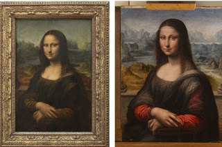
La Gioconda at the Prado, (courtesy of the Prado Museum)

La Gioconda at the Prado, (courtesy of the Prado Museum)

This twin portrait, of very similar dimensions to the Louvre version, has actually belonged to the Prado Museum for a long time; it was first recorded in 1666 as part of the Royal Collection. However, as has now been discovered, it was then considered an interesting but unexciting portrait, mainly because the figure was set in a black background as can be seen in the image above prior to restoration.. It was also thought to have been painted on an oak panel, which implied that an artist working in the Low Country (today's Holland and Belgium) painted it. Florentine artists used poplar or walnut panels for their paintings.

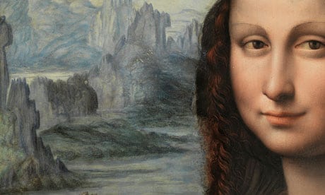
However, the spur for further investigation was an upcoming exhibition about Sainte Anne, Leonardo's last great painting,opening in March at the Louvre. The Prado experts first found that the wooden panel was indeed walnut, which meant that it was painted in Florence. Then infrared reflectography revealed that there was a landscape painted behind the lady, which echoed the landscape behind the Louvre's Mona Lisa. The removal of the black background confirmed a luminous Tuscan landscape, with the river Adda, a favourite of Leonardo. Crisper and with no sfumato, the scene helps confirm details on Leonardo's version. Apparently, the black ground was added about two centuries after the painting was executed, probably following current fashion.

a6703a3940c7958508bf07de1547.jpg
A detail of the nearly conserved Leonardo da Vinci pupil's take of the Mona Lisa. The Prado has yet to finish conservation work on the whole painting. Photograph: Museo Nacional del Pradio

A detail of the nearly conserved Leonardo da Vinci pupil's take of the Mona Lisa. The Prado has yet to finish conservation work on the whole painting. Photograph: Museo Nacional del Pradio

Not only is the background a luminous echo of the original, but the lady herself has a few interesting details which supplement those of the Louvre's Mona Lisa. Eyebrows, a frilly dress neckline, a sheer veil draped across her left shoulder and elbow, and even clearer details of the spindles of the chair in which the lady is seated - these are seen as clarifying details. All this information has led to the conclusion that this version of the Mona Lisa was painted at the same time that Leonardo da Vinci was working on his portrait of Lisa Gherardini, but that he himself did not work on this copy. Possibly the two paintings were done side by side, using the same model, maybe as a teaching exercise or maybe to duplicate a good painting for money. Indeed, Leonardo still possessed his portrait of Lisa Gherardini at his death, so he did not give the work to her husband, despite it being commissioned to celebrate the birth of her second child.

There are three names being mentioned in the press - the Spanish are talking of Francesco Melzi, a star apprentice from 1506 in Leonardo's studio, or else Andrea Salai, who joined Leonardo in 1490 and became a favoured pupil and possibly his lover. The Italians are talking of contemporaneous documents talking of a Fernando Spagnolo who was working with Leonardo in 1505 on the huge mural, the Batalla de Anghiari.

Whoever created this portrait of a young, vibrant woman in her twenties, it is intimately linked to Leonardo da Vinci and his iconic Mona Lisa.

It would, I am sure, amuse and interest Leonardo to know that over 500 years later, these two paintings are to be reunited temporarily at the Louvre later this year.

What is Invisible to others by Jeannine Cook

"Vision is the art of seeing what is invisible to others". This was an interesting remark, made by Roberto Polo, artist and founder of Citibank's Fine Art Investment Services, and quoted in the 19th November, 2011, edition of The Spectator by Bevis Hillier.

I found the idea thought-provoking, and was reminded of it in an unusual context. Tomorrow morning, at about 7.30 a.m. in Palma de Mallorca's magnificant Gothic cathedral, La Seu, there is a moment of pure magic.

Main Nave, Cathedral, Palma de Mallorca

Main Nave, Cathedral, Palma de Mallorca

At that time (and again in November) every year, the giant rose window lines up with the rising sun, and a perfect glowing circle is projected across the vast cathedral to the opposite wall, where another rose window joins in the celebration.

This huge rose window, one of the largest in the world, was created in the 14th century, in the Royal Chapel, using a Levantine design for its more than two thousand pieces of stained glass.

Rose Window, Cathedral, Palma de Mallorca

Rose Window, Cathedral, Palma de Mallorca

Its fleeting echo, twice a year, on the golden Mallorcan stone wall opposite, is an event that is anticipated eagerly for its amazing beauty.

The rose window's light cast on the opposite wall of the Cathedral, Palma de Mallorca

The rose window's light cast on the opposite wall of the Cathedral, Palma de Mallorca

These two images are courtesy of the website, Mallorcaquality.com, with my thanks.

The design and alignment, let alone actual construction, of this huge rose window is, to me, a perfect example of seeing, in one's mind's eye, what is as yet invisible to others. Its concept implied knowledge of the movement of the sun, the necessary geometrical siting in relation to the rising sun on the requisite days of the year, and an ability to calculate all these parameters and ally them with the actual building dimensions and orientation as it was being built. No computers, no cameras, no lasers. Just vision and skill.

Perhaps that ability to envision something that no one else sees and then to create something that renders the invisible visible is the ultimate hallmark of an artist, whatever the discipline. It is certainly an ability to cultivate.

Seeing the Marvellous by Jeannine Cook

Flying high above Georgia's hinterland in the dusk, I was watching all details of the land below disappear into soft evening haze. Suddenly, a marvellous swirled flash of silver and golden glints leapt from the darkness below. I gazed enthralled, for it was truly beautiful in its sinuous elegance. Then it was gone - the light and our position in the sky had changed. I later deduced that it must have been the Oconee River in its middle reaches.

The magical image stayed in my mind's eye, and I have finally tried to translate it into a silverpoint drawing – as yet unscanned. But I keep feeling that glimpse of the silvered world far below me was a wonderful, fleeting gift.

The episode made me think of a quote made by the extraordinary French poet, Charles Baudelaire. He said, "We are enveloped and drenched in the marvellous, but we do not see." He is so often correct - we live in a world of haste and stress, rushing from one thing to the next, a life style that often precludes our stopping to savour of something simple, beautiful, uplifting. Yet those moments, when we can perceive the marvellous around us, enrich and anchor our lives.

The Financial Rewards of Art and Culture by Jeannine Cook

It is not an easy time to be a member of the arts community, no matter what role each of us plays in it. On a personal level, one's colleagues all talk of funding difficulties, slow art sales, diminished public support. In the press, there are frequent reports of slashed funding for the arts and culture; today, I was reading that the Prado Museum in Madrid, flagship of Spain's museums, has had its Government support cut by six million euros and counting. Hard times... but at least the Prado is fighting back. They are now going to open seven days a week, something to celebrate.

Yet at the same time, I stumbled on a report on today's HuffPost Detroit of a report released about the impact of the arts and culture on Michigan's economy which makes one think. Some 221 arts organisations in Michigan shared their economic data to help formulate the Michigan Cultural Data Project, which analyses, on an on-going and ever-wider basis, what effect the arts have on this American state's economy. The figures are eloquent - for every dollar spent by the Michigan State on arts and culture, five-one ($51) dollars are returned to the state economy. That is quite a return.

That is the sort of message that all governments need to hear. Europeans seem more receptive to such information because they have always been keenly aware of tourist returns on investment in their cultural riches. Americans, on the whole, seem a little less aware of the huge impact that a vibrant arts scene can have - hence the importance of such information as that generated in Michigan. Even in today's less than cheery financial news coming out of Davos, Switzerland, there are ways to enhance the quality of our lives in terms of arts and culture.

Artists' Egos by Jeannine Cook

An aspect of the art world that the general public often talks about is an artist's ego - it is part of the domain of artistic myths and legends. Everyone, at one point or another, has heard about an artist seemingly behaving like a prima donna. It makes good copy for a reporter or writer and interests many readers.

Nonetheless, artists themselves seldom think specifically about ego or how they might be perceived as having a large ego. Usually we are all too involved with our artwork and artistic endeavours, and anxious to ensure its visibility, success and survival. There is usually such a clamour in the public space that it is hard to get viewed, heard, understood.

Marina Abramovic

Marina Abramovic

Marina Abramovic, a very successful artist whose reputation is coupled with a sense of serious dedication to her work, talked in an interesting way about artists' egos. She was interviewed in May 2009 by David Ebony in Art in America, and described how she had gained humility during a month-long yoga retreat in which she had participated. To achieve complete emptiness in her thinking, she talked of retraining herself to work from the top downwards, thus achieving an absence of ego. She remarked, "Our culture is so much about building up the ego of the artist. But it's not you who is important, it's the work. The ego is actually an obstacle to the work." (The image above is courtesy of the Guardian, UK, from an article by James Westcott about Abramovic's 2010 exhibition at MOMA, The Artist is Present.)

Thinking about her statement made me measure its truth. If you have envisaged a work of art and launch into making it, there is frequently an insistent little voice in your head talking about those preconceived ideas, how the work might be perceived, what effect the work might have on a viewer, etc. Emptying your mind of all expectations and simply flowing, almost instinctively, with the development of the work is a totally different affair. Things happen that you do not know consciously about, perceptions that only become obvious after coming out of the creative phase, conversations that develop in spite of or despite the ego. Making art becomes a voyage into the unknown, a voyage unaccompanied by preconceptions and that looming sense of self.

After all, at the end of any creation process, the work has to stand on its own feet, away from any reference to the artist, in many senses. This situation was driven home to me a couple of days ago when I walked into the beautiful home of a new friend. On her walls hung a number of interesting pieces of art, some of which I recognised instantly, but many of which were created by artists I did not know. Their work was just that - artwork - and each piece transmitted its messages to me. The ensuing dialogue was, of course, coloured by my life experience and perceptions, but nevertheless, the paint on canvas or drawing marks on paper had to "make their own sale" to me. The artist's ego, in each case, was a moot point. No longer were there a gallery owner or the artist at my elbow to explain and validate the work.

It seems to me that Ms. Abramovic spoke wisely about ensuring that the ego should not get in the way of creating art. Letting art guide one in its making and then in its dialogue with the world is, in truth, very complicated and yet, very simple.

Abstract Organisation by Jeannine Cook

Thinking further about composition and the fact that the path to achieving a successful painting or drawing often takes one into abstraction reminded me of a quote that I had found by British painter, Royal Academician and art professor at St. Martins, Frederick Gore. He was writing about abstract art back in the mid-fifties, rather against the tide of art in England at the time. He remarked, "The meaning of a figurative work of art lies in its abstract organisation."

Late Evening Looking towards the Crau, Frederick Gore (image courtesy of John Adams Fine Art Ltd.)

Late Evening Looking towards the Crau, Frederick Gore (image courtesy of John Adams Fine Art Ltd.)

During his long and productive life, Gore produced a huge body of work, often working en plein air, and frequently travelling to different parts of the Mediterranean region. It is interesting to look at examples of his work to see how he used abstract organisation to compose his paintings, and thus allow their meaning and impact to be strengthened.

Above, Late Evening Looking towards the Crau shows this abstract underpinning: wedge shapes are counterbalanced by thrusting mounds that echo each other through the painting, each shape linking in subtle fashion with the next.

Paysage du Luberon, Frederick Gore, (image courtesy of Charlotte Bowskill Fine Art)

Paysage du Luberon, Frederick Gore, (image courtesy of Charlotte Bowskill Fine Art)

Paysage du Luberon, another painting done in France (image courtesy of Charlotte Bowskill Fine Art), shows the same strong abstract organisation. Gore used not only the different shapes to form an abstract pattern but he used colour to lead the eye through the picture. This painting is a wonderful example of what American watercolour artist and teacher, Edgar Whitney, always talked about, namely, that a strong shape in a painting is "irregular, unpredictable and oblique".

Puig Mayor from Fornalutx, near Soller, 1958, Frdereick Gore, (image courtesy of the British Government Art Collection)

Puig Mayor from Fornalutx, near Soller, 1958, Frdereick Gore, (image courtesy of the British Government Art Collection)

Another painting, done in Mallorca of Puig Mayor from Fornalutx, near Soller, uses the shapes of the olive trees to organise the painting, with the distant mountains echoing the clumps of trees. As a counterbalance, Gore used the wonderful orange-yellow-russet fields to pull one through the whole composition.

Landscape near Deya 1958, Frederick Gore,(image courtesy of the British Government Art Collection)

Landscape near Deya 1958, Frederick Gore,(image courtesy of the British Government Art Collection)

In an even more brilliant depiction of Mallorca, also done in 1958, Frederick Gore painted this Landscape near Deya. He organised the canvas into four main abstract forms and one smaller one, always a powerful way of dealing with a composition. The olive trees again lead one into and around the painting. The abstraction allows total coherency in what Gore was meaning to say about this hot, sunlit Mediterranean mountainside.

On a more personal note, I always love seeing how other artists respond to the landscapes of Mallorca, an island I know and love deeply. Despite the more than fifty years since these two paintings were done, this part of Mallorca is not that dramatically changed, something to be celebrated.

Frederick Gore certainly put into personal practice what he advocated. It is good to remind oneself of how to organise an eloquent, powerful work of art through abstraction.

Today's Realities in the Art World - as per Mat Gleason by Jeannine Cook

Once in a while, thanks to all those links that artists post on Facebook, one stumbles on an interesting article that is a tonic to read. Today's art article by Mat Gleason of the Coagula Art Journal - " Twelve Art World Habits to Ditch in 2012" - is worth a read in the Huffington Post.

Lots of what Gleason said is pretty obvious, but it is worth having a robust reality check.

The Whole Composition by Jeannine Cook

A visual artist always has a set of decisions to make at the beginning of a work - how to compose the picture, what to emphasise, what to convey by the way the picture is composed. That is in part why so many people advocate doing thumbnail sketches before embarking on a painting or drawing; one needs to work out a sensible road map, a composition that works.

Henri Matisse once remarked, "I don't paint things. I only paint between things." He paid close attention to the relationships between objects and how they relate to the whole composition. In a way, he was, in essence, creating an abstract web and underpinning to the composition by looking at the negative spaces, versus focusing on the "things".

Still Life with Geraniums, Matisse, 1910 (image courtesy of the Pinakothek der Moderne, Munich)

Still Life with Geraniums, Matisse, 1910 (image courtesy of the Pinakothek der Moderne, Munich)

Look, for instance, at this Still Life with Geraniums which Matisse painted in 1910. There is a wonderful, energetic structure going on thanks to the contrasts between the horizontals and verticals and the organically curvaceous objects and flowers. Half-closing your eyes and looking at the negative spaces in the painting leads to a really strong, dynamic underpinning to the work. Yet there is also a sense of space and airiness that was one of Matisse's great skills. His paintings looked out, not inwards in a hermetic fashion.

In the same way, the 1912 painting, The Window at Tanger, relies heavily on the relationships between the sense of space and spaciousness and the "things". (The image is courtesy of the Pushkin Museum of Fine Arts, Moscow.)

The Winndow atTanger, Henri Matisse, 1912, (Image courtesy of the Pushkin Museum of Fine Arts, Moscow.)

The Winndow atTanger, Henri Matisse, 1912, (Image courtesy of the Pushkin Museum of Fine Arts, Moscow.)

The deep blue knits everything together, but flattens the space into a near-abstract image. Matisse visited Morocco in 1912 and again in 1913, and the bright colours and flat perspective show the influence that Islamic art was having on Matisse. He had already brightened his palette considerably with his Fauve period, so it was a logical development to embrace the brilliance of the Moroccan world. He used the "differences" in this scene from his hotel window to knit together an enormously evocative and energetic composition.

Another very different approach to the concept of composing a picture by concentrating on the spaces between objects can be seen in Rembrandt's prints. When he was working on his etchings, he was so technically skilled that he could fade out the contours of objects he was depicting and allow the "differences between things" to evoke the desired effect. Seventeenth century Italian art historian and connoisseur, Filippo Baldinucci, remarked, "that which is truly noteworthy of this artist (Rembrandt) was his remarkable style that he invented to etch in copper - that is, loose hatching and irregular lines and without contours he succeed in making profound contrasts."

Rembrandt's 1654 etching, The Descent from the Cross

Rembrandt's 1654 etching, The Descent from the Cross

Rembrandt's 1654 etching, The Descent from the Cross, is one example. Few contours, wonderful spaces between "things" and an arresting composition all are rendered more powerful by this technique that Baldinucci described.

The Woman before a Dutch Stove, Rembrandt, 1658 etching

The Woman before a Dutch Stove, Rembrandt, 1658 etching

In the same way, the spaces between, so expertly depicted and so vital to the composition, are masterfully achieved in this 1658 etching, The Woman before a Dutch Stove.

For every artist working now, it is always rewarding to go back and study attentively what has been done by the great artists of the past. The Internet helps greatly in allowing us to see these images, but there is, even now, a huge difference between these digital images and the actual artwork. That is when seeing how Matisse actually applied paint to the canvas as he evoked those relationships between things, or peering at Rembrandt's etchings, with their amazing hatching, through a magnifying glass, allow us to see the artist's hand and deft, skilled touch. Those details allow the ultimate consolidation and achievement of the composition, the relationships of things one to the other and thus to the whole work.

Getting down to work in art by Jeannine Cook

I wonder if everyone else has a hard time getting down to work again after the holiday period? As an artist, I find it is so easy just to let the days slip by, to think about what I am going to do, do office work, drift and dream.

Then I reread a quote I had noted some time ago from Julia Cameron's The Artist's Way. She remarked crisply, "Art is not about thinking something up. It is the opposite - getting something down." Ho - ho! Time to get doing – to stop devising the way to do something new and different, and just get down to trying to do it.

It is, in essence, putting into practise what I was drawing - namely getting the fire going again – like this silverpoint drawing I did, which I entitled

Flames of Oak, silverpoint, Jeannine Cook artist

Flames of Oak, silverpoint, Jeannine Cook artist

What to do and how to do it are perpetual questions that each artist asks of him or herself. Even beyond those questions, there are other considerations, such as one that was evoked by a thoughtful friend recently. She was describing walking along a beach and collecting sharks' teeth with delight. She remarked that she tended to disdain shells for most of them had some imperfection. She then questioned her own judgement - who was she to judge of the merit of a shell, its state and level of beauty? And how did one know when something was beautiful? What are the criteria that the definition of beauty should meet?

These are all questions every creative person grapples with at one point or another. I replied that I thought the definition of beauty was, to a great degree, dependent upon the life experience one brought to the consideration, and was a very personal affair. Nonetheless, personally, there is a still, small voice in my head - or my heart, who knows - which says insistently - that is beautiful, that is worthy of intense scrutiny and appreciation. Stop and look - hard.

That is when, for me, the process of "getting something down" in art begins. Something magical has gone "clic" and then it is simply the nitty gritty of getting myself organised, out of my holiday optic – and getting down to work. Mañana!

Drawing by Jeannine Cook

One of the nice aspects of the contemporary art world is how drawing is thriving.

Twenty-five or thirty years ago, when I started seriously learning of the American art world, draughtsmen and women seemed to have a rather thin time. It was a very rare connoisseur, especially in the United States, who either knew much about drawing media or appreciated drawings for the sake of drawings. The Drawing Center in New York, for example, was founded in 1977. Interestingly, it claims in its mission statement still to be the only not-for-profit fine arts institution in the country to focus solely on the exhibition of drawings, both historical and contemporary.

Few young artists were taught to draw - it was not really considered necessary, it seemed. Life drawing was the domain of the few, and eye-hand coordination skills were seldom talked about. The Natural Way to Draw, Nicolaides' now-famous book, completed after his death by a friend and student,Mamie Harnon, was little known, I learned. Silverpoint drawing was virtually unknown - there were very few artists using this medium.

Slowly, slowly, there has been a groundswell in the drawing world. A few exhibitions here and there, more and more institutions, like the Arkansas Arts Center, seriously collecting contemporary works on paper which were mostly drawings in different media... more courses taught. For silverpoint, there was the seminal exhibition in 1985, curated by Dr. Bruce Weber, at the Norton Museum of Art in Palm Beach, Fl, called The Fine Line: Drawing with Silver in America.

Now, there is a wonderful change. Not only are there regularly Master Drawing exhibits around the country, but there is a great deal of interest generated by the institutions famed for their drawing collections, ranging from the National Gallery or the Metropolitan Museum of Art to the Morgan Library in New York. Courses are widely offered, magazines devoted to draughtsmanship. Galleries are more willing to show contemporary drawings. You know there is wide acceptance of an art form when art fairs begin to focus on it. For instance, this is the sixth year that the fair, "Master Drawings New York", is being held across twenty blocks of New York's' Upper East Side, for nine days , as of 20th January. Its co-founder, Crispian Riley-Smith, is quoted in this month's Art+Auction magazine, as saying, "Drawings are quite intimate, and people need to take their time to look at them."

Another indication of how widespread is the acceptance and practice of the many drawing media are now is to glance through one the the art catalogues that land in one's mail box (surprisingly in today's on-line commercial world!). Jerry's Artarama, for example, has 51 pages in its "Drawing" section, and that does not include any of the pages devoted to Paper (which constitutes another 48-odd pages....). The total catalogue has some 560 pages for everything, from paint to frames... so you can judge how important drawing has become to the purveyors of art materials.

As with every skill that becomes more widespread and more accepted, there is a flowering of ideas, of innovations and approaches. New materials used, fresh combinations of media, different ways to express oneself - the state of drawing is vibrant and healthy. What fun and how wonderful to see this happen. A good omen for 2012.