composition

The Dynamics of a Blank Piece of Paper by Jeannine Cook

We artists have all faced the blank sheet of white paper or canvas, time and time again. It can be a daunting moment. Yet it can also be the start of a fascinating balancing act, whose dynamics hark back to the earliest cave drawings, the origins of calligraphy and the vast heritage of both Eastern and Western art-making.

"Tabula rasa"

"Tabula rasa"

Some while ago, I found a marvellous statement by the wonderful British artist, Rebecca Salter,about the state of a piece of paper. She talked of an old Chinese saying that "a piece of paper is not empty until you have made the first mark", a saying which underlines the dynamics between a mark that you make on that paper and the blank space around it.  She continued by saying that "the word 'blank' is, however, misleading as the space, instead of becoming a space of nothingness, is 'activated by the presence of the drawn or painted mark".

This concepts seems to go to the very heart of composition, of a sense of balance and fitness of the symbiotic relationship of the marks placed on that surface.  It also ensures that your particular style, your hallmark as an artist, will be evident from the dynamics of your choices of marks made on that blank sheet of paper.

Calligraphy, from all traditions, has been based on this concept of dynamic balance on the page.

Japanese calligraphy

Japanese calligraphy

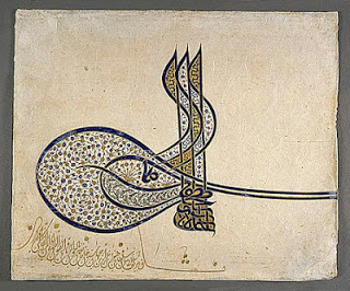
Ottoman tugra of Suleiman the Magnificent,1520, with flowers and saz leaves

Ottoman tugra of Suleiman the Magnificent,1520, with flowers and saz leaves

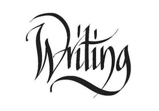
Present-day Western calligraphy

Present-day Western calligraphy

These examples from different types of calligraphy are wonderful examples of the dynamics that can be created on a black piece of paper. However, we can all be mindful of those potential relationships that we can work with when we face that sheet of paper.

The Whole Composition by Jeannine Cook

A visual artist always has a set of decisions to make at the beginning of a work - how to compose the picture, what to emphasise, what to convey by the way the picture is composed. That is in part why so many people advocate doing thumbnail sketches before embarking on a painting or drawing; one needs to work out a sensible road map, a composition that works.

Henri Matisse once remarked, "I don't paint things. I only paint between things." He paid close attention to the relationships between objects and how they relate to the whole composition. In a way, he was, in essence, creating an abstract web and underpinning to the composition by looking at the negative spaces, versus focusing on the "things".

Still Life with Geraniums, Matisse, 1910 (image courtesy of the Pinakothek der Moderne, Munich)

Still Life with Geraniums, Matisse, 1910 (image courtesy of the Pinakothek der Moderne, Munich)

Look, for instance, at this Still Life with Geraniums which Matisse painted in 1910. There is a wonderful, energetic structure going on thanks to the contrasts between the horizontals and verticals and the organically curvaceous objects and flowers. Half-closing your eyes and looking at the negative spaces in the painting leads to a really strong, dynamic underpinning to the work. Yet there is also a sense of space and airiness that was one of Matisse's great skills. His paintings looked out, not inwards in a hermetic fashion.

In the same way, the 1912 painting, The Window at Tanger, relies heavily on the relationships between the sense of space and spaciousness and the "things". (The image is courtesy of the Pushkin Museum of Fine Arts, Moscow.)

The Winndow atTanger, Henri Matisse, 1912, (Image courtesy of the Pushkin Museum of Fine Arts, Moscow.)

The Winndow atTanger, Henri Matisse, 1912, (Image courtesy of the Pushkin Museum of Fine Arts, Moscow.)

The deep blue knits everything together, but flattens the space into a near-abstract image. Matisse visited Morocco in 1912 and again in 1913, and the bright colours and flat perspective show the influence that Islamic art was having on Matisse. He had already brightened his palette considerably with his Fauve period, so it was a logical development to embrace the brilliance of the Moroccan world. He used the "differences" in this scene from his hotel window to knit together an enormously evocative and energetic composition.

Another very different approach to the concept of composing a picture by concentrating on the spaces between objects can be seen in Rembrandt's prints. When he was working on his etchings, he was so technically skilled that he could fade out the contours of objects he was depicting and allow the "differences between things" to evoke the desired effect. Seventeenth century Italian art historian and connoisseur, Filippo Baldinucci, remarked, "that which is truly noteworthy of this artist (Rembrandt) was his remarkable style that he invented to etch in copper - that is, loose hatching and irregular lines and without contours he succeed in making profound contrasts."

Rembrandt's 1654 etching, The Descent from the Cross

Rembrandt's 1654 etching, The Descent from the Cross

Rembrandt's 1654 etching, The Descent from the Cross, is one example. Few contours, wonderful spaces between "things" and an arresting composition all are rendered more powerful by this technique that Baldinucci described.

The Woman before a Dutch Stove, Rembrandt, 1658 etching

The Woman before a Dutch Stove, Rembrandt, 1658 etching

In the same way, the spaces between, so expertly depicted and so vital to the composition, are masterfully achieved in this 1658 etching, The Woman before a Dutch Stove.

For every artist working now, it is always rewarding to go back and study attentively what has been done by the great artists of the past. The Internet helps greatly in allowing us to see these images, but there is, even now, a huge difference between these digital images and the actual artwork. That is when seeing how Matisse actually applied paint to the canvas as he evoked those relationships between things, or peering at Rembrandt's etchings, with their amazing hatching, through a magnifying glass, allow us to see the artist's hand and deft, skilled touch. Those details allow the ultimate consolidation and achievement of the composition, the relationships of things one to the other and thus to the whole work.