The Power of a Line by Jeannine Cook

I saw a really interesting small exhibition that came from the Josef and Anni Albers Foundation in Bethany, Connecticut. It was at the Fundación Juan March in Palma de Mallorca and will be at the Museo de Arte Abstracto Español in Cuenca from now until October 5, 2014. Josef Albers: Process and Printmaking (1916-1976) was a small exhibition, divided into three sections.

His first woodblock prints, in black and white, are a far cry from the vivid colours and abstractions of his later work in the United States.

Albers was first inspired by the coal mining landscapes of his native Northern Rhine-Westphalia region in Germany; he turned to print-making not only for its economy of production but also for the creative liberty that the medium allowed him.

He was deeply engaged, not only in the manual involvement of how art is made in the printing process, but also in the exploration of how far he could push the possibilities of the medium. Endlessly inventive and questing, he clearly kept saying to himself, “What if I did this – or that?”

Questions that every artist should be constantly asking him or herself.

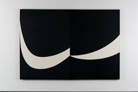
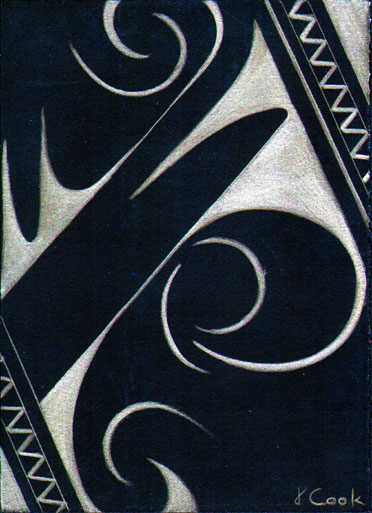
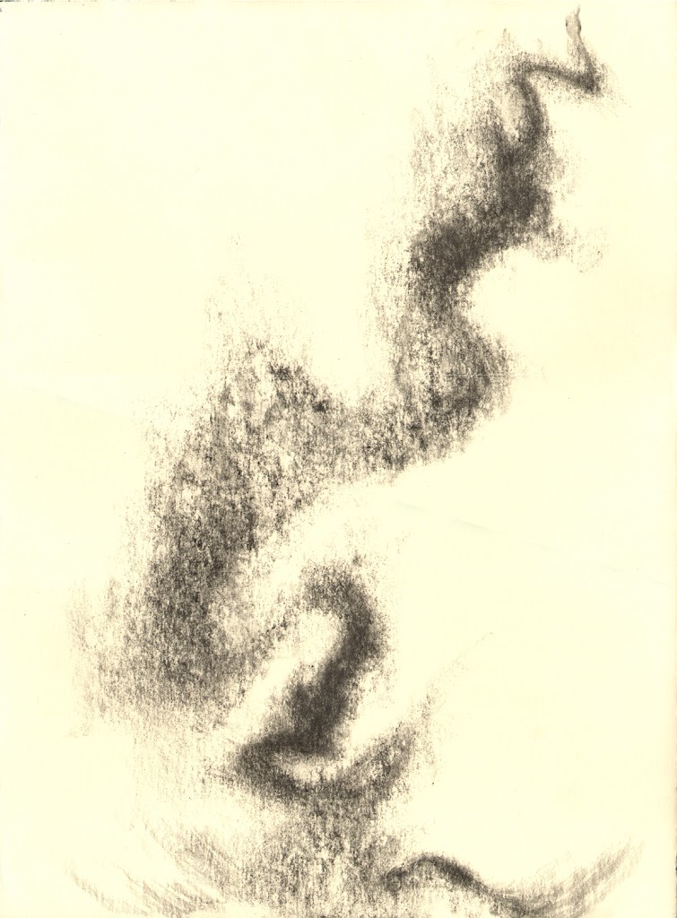
One particular series was especially interesting to me, for it showed just how powerful each line can be in a drawing or print, and if one changes the emphasis of just one line, the whole composition and content of the work changes.

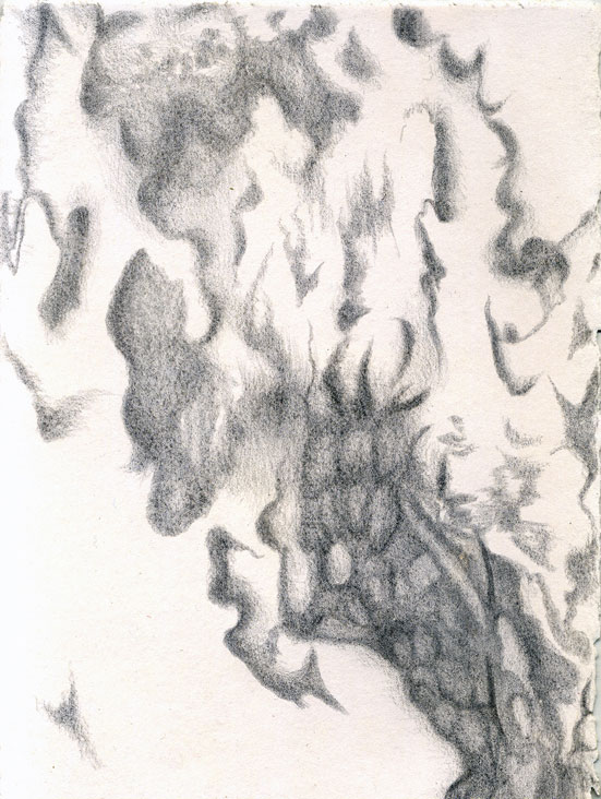
As Albers said, “Everything has form and every form has meaning”, and his simple series that ended as Multiplex A-D done in 1947-8, demonstrated that perfectly. Alas, his preparatory drawings which are in the exhibition don’t seem to be available on the Web. But even there, the progression of ideas and different emphasis each time on a principal line versus a secondary line underlined how Albers understood so well how art can be changed a great deal, even just by a thin or thicker line.

The preparatory drawings and studies for the Multiplex series ranged from pencil drawings on paper, then on tracing paper, sometimes using a red pencil for emphasis, sometimes a blue pencil.

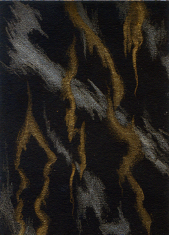
Finally, having worked out the range of possibilities for that play of lines, Albers moved to studies on paper for each version of the series, then gouache over proof of a woodblock print.

Meticulous and yet questing, the preparation for such seemingly simple prints is instructive. Josef Albers had planned out exactly what he wanted to say, the emphasis each time on his view of each line’s importance. In other words, the more he prepared and thought about each work, the more pared down and powerful it became a lesson for us all!

These are the woodbock prints that are the results of the Multiplex series’ preparation.

Each line is eloquent and functions as a vital part of the composition, in a “major” or “minor key”.

Multiplex A, 1947, Josef Albers, Woodblock on paper, 16 1/2 x 12 1/2"

Multiplex A, 1947, Josef Albers, Woodblock on paper, 16 1/2 x 12 1/2"

Multiplex B, 1948, Josef Albers, Woodblock on paper, 16 1/2 x 12 1/2"

Multiplex B, 1948, Josef Albers, Woodblock on paper, 16 1/2 x 12 1/2"

Multiplex C, 1948, Josef Albers, Woodblock on paper, 16 1/2 x 12 1/2"

Multiplex C, 1948, Josef Albers, Woodblock on paper, 16 1/2 x 12 1/2"

Land Art, Burgundy Style by Jeannine Cook

That’s life for you, isn’t it! All of a sudden, there is so much of fascination to blog about and share with the world, and at the same time, there is the quandary of what to do – blog or draw?And there are only those twenty-four hours in the day, alas. Nonetheless, I will burn the midnight oil a little to celebrate a wonderful event that I was privileged enough to share this weekend.

In a green and harmonious forest, deep in Burgundy, France, there is now a magically glowing Green Giant, a living forest sculpture created by Alain Bresson, a noted French artist.

Alain Bresson at the Forest Inauguration (image courtesy of Michelle Anderson Binczak)

Alain Bresson at the Forest Inauguration (image courtesy of Michelle Anderson Binczak)

Alain has been creating imaginative sculptures that celebrate the world around us for a long time, with work exhibited in notable venues in Paris, as well as Africa and other parts of Europe.

His land art is increasingly welcomed in exhibitions that draw attention to our environment, and in the case of the inauguration I attended, his imaginative empathy and understanding of the forest was clear.

Le Geant Vert 2, Alain Bresson, living sculpture (image courtesy of Michelle Anderson)

Le Geant Vert 2, Alain Bresson, living sculpture (image courtesy of Michelle Anderson)

The Green Giant came about almost by chance – as Alain laconically and self-deprecatingly recounted at the inauguration, deep in the lush forest surroundings, he was walking in the local community forest. He suddenly saw the two strangely configured maples growing together and realized their possibilities. He had already had troubles with his own village. The authorities there made him destroy a previous Green Giant sculpture, but happily, in the case of the adjacent community of Argentenay, near Tonnerre, the Mayoress, Catherine Tronel, was more than receptive to having him create a living sculpture in the “forêt communale”.

So Alain covered the trees with yet more moss, which glowed luminously after all the rain we have had, and added delicious touches of scarlet to make the Giant gloriously jaunty. Moss globes, also with flamenco-style flowers tucked in to add allure, were hung from other trees to add depth to the scene. At the inauguration, as Alain explained, we could not yet see the total scene as he had planted different seeds in the moss and in the Giant’s foreground. They will germinate and change the effect, and make the Giant an evolving sculpture that will continue living for years to come. Much more fun than a sculpture that is created and then, that’s it, once it is placed in its official position.

As you parked by burnished pale gold grain fields and then walked into this cool forest, where birdsong is the only sound you normally hear, it was like entering a magical green world.

Burgundy fields, Argentenay, (image courtesy of Michelle Anderson)

Burgundy fields, Argentenay, (image courtesy of Michelle Anderson)

Then suddenly this hugely tall green presence arrests and surprises, then delights. There is power and whimsy, and ultimately, a deep respect for our oh-so-important forests. Alain Bresson has travelled a long and successful route since he first went walking in the local countryside as a small boy on a school outing. While all the rest of his class brought back bunches of poppies and daisies to the teacher, he brought back branches, sticks and nettles. The teacher was horrified and reduced the eight-year–old to tears with his reproaches.

Now, I suspect, were that teacher to see The Green Giant, he would be of a different mind about Alain’s selections and skill.

Le Géant bourguignon qui habite le village d' Argentenay by Jeannine Cook

Vous entrez dans une fôret lumineuse, spacieuse, où les verts sont intenses, infinément variés. Le sentier serpente, invite à se délaisser, à explorer. Et soudain on voit une boule de mousse, ornée d’une fleur vivement rouge, suspendue d’une branche. Puis, en voilà une autre. Ainsi, les yeux vers les cîmes des arbres, on aperçoit, d’un coup, le Géant Vert qui vous contemple de son hauteur impressionnante.

Le Géant Vert, Argentenay, photo de Michelle Anderson

Le Géant Vert, Argentenay, photo de Michelle Anderson

Son créateur, le sculpteur Alain Bresson, l’a créé de deux érables vivants qui ont une forme entremêlée se prêtant à devenir “une personne”.

Alain Bresson, photo de Michelle Anderson 

Alain Bresson, photo de Michelle Anderson 

Alain Bresson n’est point étranger à ces formes de “land art” dans la nature, car il en a créé maintes versions dans sa longue carrière artistique. Il est reconnu pour ses oeuvres qu’il expose avec beaucoup de succès à Paris, en Allemagne, en Afrique, un peu partout. Mais c’est d’abord chez lui, dans sa communauté même, qu’il a voulu créer un Géant dans la fôret. Pourtant, sa sculpture fut mal vue par l’hiérarchie élue; Alain fut obligé à détruire son oeuvre!

Heureusement pourtant, la jolie petite communauté d’Argentenay, (en Bourgogne), voisine de celle d’Alain, a été très receptive à l’idée qu’Alain a proposée de transformer deux érables vivantes en Géant Vert. L’inauguration a eu lieu le samedi 5 juillet, avec la présence de notables tels que M. Raymond Le Deun, Préfet de l’Yonne, M. François Patriat, Président du Conseil Régional de Bourgogne, M. André Villiers, Président du Conseil Général de l’Yonne, M. Jean-Jacques Gleizal, ancien Président du FNAC Bourgogne, et, bien sûr, Mme. Catherine Tronel, Maire d’Argentenay. Alain Bresson a brièvement expliqué que l’énorme personnage du Géant Vert est parsemé de graines dans la mousse lumineuse. Elles vont pousser bientôt pour ensuite acceueillr les oiseaux, les papillons, les fourmis.

Le Géant va ainsi évoluer, changer, se répandre en beauté. Sa splendeur verte intense va fluctuer au fur et à mesure que le temps se sèche ou que la pluie tombe, tout comme chaque être vivant. Par dessous de leurs revêtements de mousse, les deux arbres vont poursuivre leur croissance lente, au rhythme de la forêt qui les entoure.

Grâce à Alain Bresson, nous avons tous, en coeur d’une si belle forêt de Bourgogne, un Géant Vert qui nous aide à célébrer la nature, qui est, en fait, notre meilleure amie.

Colour versus Black and White by Jeannine Cook

When you are surrounded by brilliant, sunlit hues and above the sky is blindingly blue, it is easy to be captivated by colour and want to translate it into your art. We all resonate to colour, and it is and always has been the dominant approach to painting. Nonetheless there are those, artists and art lovers, who also resonate to black and white and shades of monochrome in between.

I read of a perfect summation of this difference in an El Pais article about the resurrection of the Leica camera, once considered the ne plus ultra of 35 mm. cameras for most of the 20th century. Every great photographer, from Capra to Henri Cartien-Bresson used a Leica because it was quiet, highly portable and had remarkable lenses that allowed fantastic photographs to be taken. Cartier-Bresson believed too that all edits to the image should be made when the photo was being taken, not afterwards in the darkroom.

Near Strasbourg, 1945, Henri Cartier-Bresson

Near Strasbourg, 1945, Henri Cartier-Bresson

Until the digital camera came along, Leicas were much esteemed. When the then nearly bankrupt company was bought out in 2005 by Andreas Kaufmann, heir to an Austrian paper company fortune, a fascinating development occurred. Andreas Kaufmann gambled on differentiating Leicas from all other digital cameras: the M Monochrom Leica only takes black and white images. When this Leica was launched in May 2012, the model was priced at a cool 6,800 euros. It has become a runaway success in the photographic world, selling like hot cakes through Leica Boutiques around the globe.

As Andreas Kaufman was quoted as saying, “For me, colour is more emotion, while black and white represents structure.” The remark resonated with me.

True, I was brought up with a grandfather and mother both photographing in black and white in East Africa. In fact, they were so successful that they kept the farm going on photographic sales during the dreadful Great Depression years when the farm was in its infancy and barely sustained them as a family. I have always considered black and white photographs of the 1930-50 era in Europe as marvellous works of art, as well as the amazing photographs that Edward Weston and Ansel Adams took in the earlier 20th century. 

Kelp, Point Lobos, 1930, Edward Weston

Kelp, Point Lobos, 1930, Edward Weston

Onion Halved, 1930, Edward Weston

Onion Halved, 1930, Edward Weston

Pine Cone and Eucalyptus Leaves, San Francisco, 1932, Ansel Adams

Pine Cone and Eucalyptus Leaves, San Francisco, 1932, Ansel Adams

Mount Williamson, Sierra Nevada, from Marzanar, CA, 1944 (Image courtesy of  MOMA)

Mount Williamson, Sierra Nevada, from Marzanar, CA, 1944 (Image courtesy of  MOMA)

By the Seine, Robert Doisneau

By the Seine, Robert Doisneau

I also love black and white drawings for their immediacy and unadorned truth of execution. Look at this one for direct simplicity and power of composition.

Self Portrait, 1924, charcoal, Kathe Kollwitz

Self Portrait, 1924, charcoal, Kathe Kollwitz

Even black and white paintings have an impact that indeed speaks of structure and logical thought.

Atlantic, 1956, Ellsworth Kelly (Image courtesy of Whitney Museum of American Art, New York)

Atlantic, 1956, Ellsworth Kelly (Image courtesy of Whitney Museum of American Art, New York)

Uneasy Centre, 1963, Bridget Riley

Uneasy Centre, 1963, Bridget Riley

It is as if you can get your teeth into a black and white work of art, while one in colour is a fraction fuzzy, tugging at emotion and heart strings. Portraits, landscapes, even still life or abstracts: they all evoke passion, sympathy, joy, sorrow, lyricism. Black and white images seem more cerebral, more challenging often. I find it logical that I am more and more fascinated by metalpoint drawing – it is all back to black and white. 

Plus ça change, plus ça reste la même!

When Artistic Seeds Germinate by Jeannine Cook

Last year, I felt I was seriously in need of being shaken around as an artist, as I was too often wont to work in my comfort zone. I was experimenting every time I could, but there were not many occasions to work as an artist as other events were impinging too hard on my life.  Nonetheless, the experiments were not all that daring, I felt. 

Frail Remnants, silverpoint/Mylar, 7 x 10", Jeannine Cook artist

Frail Remnants, silverpoint/Mylar, 7 x 10", Jeannine Cook artist

This was one line of work - a mixture of realism and stylised silhouettes in Mylar.  Another line of  subject matter I was exploring was my on-going series on tree barks.

Balearica V - Lemon Tree Bark, silverpoint, 5 x 3.5", Jeannine Cook

Balearica V - Lemon Tree Bark, silverpoint, 5 x 3.5", Jeannine Cook

Another series was totally abstract, seemingly, but in reality, based on the extraordinary designs that Neolithic man had already devised for his pottery.

Basilicata #1, silverpoint, 7.5 x 5.5", artist Jeannine Cook

Basilicata #1, silverpoint, 7.5 x 5.5", artist Jeannine Cook

Nevertheless, I felt that I needed to free up, something that is quite hard to do with metalpoint drawing, as there is a terrific feel of friction, well almost friction, when one has the stylus making marks on the drawing surface.  I wondered whether I needed to work much bigger, but also felt that for that purpose,  metalpoint would be a very big challenge.  So I decided that at my residency last summer at Draw International, in France, I would take lots of other drawing media and see what came of it all.

I soon realised that I needed to free up from more than just drawing inhibitions.  I had to work through an enormous amount of stress from family illness with which I had been coping, even to getting enough sleep. Then I found that I was indeed being pushed out of any comfort zone, utterly.  Of course, the resultant work was all over the place, but mostly I was using graphite, a much more forgiving medium and one that allowed for all sorts of smudged and gestural effects, the antithesis of metalpoint effects.

Caylus, 14th July, graphite, 15 x 11" artist Jeannine Cook

Caylus, 14th July, graphite, 15 x 11" artist Jeannine Cook

Fractured, Caylus, graphite, 15 x 11", artist Jeannine Cook

Fractured, Caylus, graphite, 15 x 11", artist Jeannine Cook

I struggled on, feeling at sea, conscious that I needed to feel at sea, but of course, that is never a happy place to be as an artist! I just had to listen to the small inner voice, that old friend, and be counselled that sooner or later, things would begin to work out and I would find my voice, albeit, I hoped, a slightly different and better one.  Part of the trouble was, of course, that I have continued to have very little time to devote to art and to bury myself in it.

However, I had the luck to go off for the two blissful weeks to the artist residency I was given at OBRAS Portugal this early spring.  There, suddenly, things began to feel more comfortable.  Yes, I am still doing realistic things, but not always in the predictable realistic way of yore.  I feel more comfortable in daring and venturing into much more unpredictable ways of working.  In short, I am finding new voices, slowly slowly.  The seeds that were rather painfully planted last year in my garden of art are slowly beginning to germinate.  That is exciting.

Alentejo IV, graphite, 15 x 11", artist Jeannine Cook

Alentejo IV, graphite, 15 x 11", artist Jeannine Cook

Evoramonte Shadows, silverpoint/watercolour, 12 x 9", artist Jeannine Cook

Evoramonte Shadows, silverpoint/watercolour, 12 x 9", artist Jeannine Cook

Cork Oak I, gold/silverpoint, 3.5 x 5.5", artist Jeannine Cook

Cork Oak I, gold/silverpoint, 3.5 x 5.5", artist Jeannine Cook

Lichen Shimmer I, gold/silverpoint, 3.5 x 5", artist Jeannine Cook, private collection

Lichen Shimmer I, gold/silverpoint, 3.5 x 5", artist Jeannine Cook, private collection

The Passion to Create by Jeannine Cook

Recently, I was listening to an interview Diane Rehm did on public radio with David McCullough, Jr.  At one point, he remarked that creative passion cannot be taught.  It can only be caught.  I thought that was so true.

Everyone needs a passion to create something; it is the fire that burns to get one going, to get one out of the bed in the morning.  A dear friend of mine, alas, has lost any passion for anything, let alone anything creative, and she is seriously adrift.  Another friend reminded me this week how important a passion for needlepoint was for her.  Not surprising, as she creates the most wonderful art with her skillful needle.

Perhaps artists of all descriptions are very fortunate to burn with a passion to create.  It gives coherence and meaning to life, even if it does mean that one is driven by a sometimes stern taskmaster. I am not sure that such passion even implies that the artist has clearly defined objectives on all occasions.  Sometimes one blindly gropes, only knowing that you have to start work on creating something.  With time and experience, the artist knows that that small inner voice will help with the creative process, acting as guide and critic.  Nonetheless, it is the energy from passion that motivates and drives the artist to work.

There are so many examples of artists, in all disciplines, who are driven by their passion.  Degas, for example, was single-minded in the extreme; he devoted his entire life to drawing and painting, even as his eyesight hindered him more and more. As he remarked, "No art was ever less spontaneous than mine. What I do is the result of reflection and of the study of the great masters; of inspiration, spontaneity, temperament, I know nothing."  But he drove himself. His series of studies of dancers was a huge part of his opus, a passion to which he returned again and again.

Dancer adjusting her shoe, 1885, Edgar Degas, pastels

Dancer adjusting her shoe, 1885, Edgar Degas, pastels

  Edgar Degas, A Dancer at the Bar, charcoal and white chalk.

  Edgar Degas, A Dancer at the Bar, charcoal and white chalk.

Passionate or obsessive - sometimes it is hard to differentiate for the outsider who is observing the artist.  The drive to create can sometimes seem like an extreme - think of Beethoven as he composed magnificent music whilst struggling with his deafness.  I am sure that the passion/madness of Vincent van Gogh is one of the most famous of cases of visual artists driven to go on working.  The years 1888- 89 were the example of a time when Van Gogh was into the most astonishing mark-making, requiring such energy and application.  Clinging to his art, he worked and worked at these drawings, in the sunlit countryside around Arles, mostly using a reed pen and ink.  Here he was returning to his belief that drawing was "the root of everything." 

Vincent van Gogh, 1888, Garden with Flowers, pen & ink

Vincent van Gogh, 1888, Garden with Flowers, pen & ink

Vincent van Gogh, The rock of Montmajour with pine trees, 1888. Van Gogh Museum, Amsterdam

Vincent van Gogh, The rock of Montmajour with pine trees, 1888. Van Gogh Museum, Amsterdam

Vincent van Gogh, Olive Trees in a Mountain Landscape, black chalk, brush, brown ink, Saint-Rémy: June 17 or 18, 1889, Van Gogh Museum, Amsterdam

Vincent van Gogh, Olive Trees in a Mountain Landscape, black chalk, brush, brown ink, Saint-Rémy: June 17 or 18, 1889, Van Gogh Museum, Amsterdam

As one's own passion to create is sometimes dimmed by the quotidian, with daily life chipping away at time and quiet, it is good to remember that the flame inside can still burn.  It may burn less brightly at times, but it is still there.  That makes life very special.

Boulders, Works of Art or Something More Important? by Jeannine Cook

Reading an article by Stephen Knudsen in April-May’s edition of Professional Magazine entitled ”To see a Work of Art” made me think back to a recent experience I had in Portugal. Knudsen’s article was about spending a day at the Los Angeles Museum of Art to see sculptor Michael Heizer’s LevitatedMass. 

Michael Heizer, Levitated Mass, 2012, diorite granite and concrete, height: 35 ft., 7 in.; width: 21 ft., 8 in.; length: 456 ft.; granite weight: 340 tons © Michael Heizer.

Michael Heizer, Levitated Mass, 2012, diorite granite and concrete, height: 35 ft., 7 in.; width: 21 ft., 8 in.; length: 456 ft.; granite weight: 340 tons © Michael Heizer.

Steve Knudsen first explained about the controversy surrounding the granite boulder’s final installation at the Museum in 2012 after Heizer first sketched out the idea back in 1969.Then Knudsen described the rewards of sitting watching this enormous boulder suspended over a ramp, ranging from the reactions of fellow visitors of all ages to the final crescendo at sunset of the boulder seeming to rise as the sun sank. He comments that “the seemingly grand narrative of moving the rock was, in the end, just a blip in the bigger story that points to sublime space, celestial movement and geologic time” (my thanks to him for this quote).

His remarks took me straight back to my amazing hours in early March at the Cromlech dos Almendres, near Evora in Portugal. One of the most important megalithic complexes in Europe, it is sited on a gentle hillside, overlooking rolling hills towards Evora, amidst olives and cork oaks. Daring from the 6th millenium BC, this extraordinarily grandiose ensemble of roughly one hundred boulders takes one's breath away as you approach the wide-flung site.

Cromlech dos Almendres,Nossa Senhora de Guadalupe, Portugal, photograph Jeannine Cook

Cromlech dos Almendres,Nossa Senhora de Guadalupe, Portugal, photograph Jeannine Cook

Just as Michael Heizer must have thought long and hard about his boulder, its shape, its material, its potential home and how it would best be viewed there, its messages and meaning to anyone viewing it – even how to transport it to the site, so too, our ancestors must have spent much time planning the Cromlech dos Almendres.

Like Heizer’s boulder, the huge megalith boulders are granite. Wonderful shapes, some of these monoliths have some carving on them, now well worn, but still hugely evocative as the sun moves and catches different angles and shapes on their surfaces.

Cromlech dos Almendres, photograph Jeannine Cook

Cromlech dos Almendres, photograph Jeannine Cook

Cromlech dos Almendres carved boulder

Cromlech dos Almendres carved boulder

Apparently these boulders were placed at different times, in concentric circles and later ellipses, all on a southeast-northwest axis. The entire group occupies an area of about 70 by 40 meters. Many of these massive stones are three meters high, while others, of earlier date, are slightly smaller.

Just to transport them to this hillside must have required incredible effort and organization, let along to site them and erect them into a vertical position. The endeavour speaks of enormous religious and social fervor, amongst groups of people who were few in number to start with. Connections with the land, their gods perhaps, their social structures – this was a huge undertaking to assemble these wonderfully powerful and eloquent boulders. Perhaps too the ensemble of monoliths was used for astronomical purposes.

Cromlech dos Almendres,Nossa Senhora de Guadalupe, Portugal, photograph Jeannine Cook

Cromlech dos Almendres,Nossa Senhora de Guadalupe, Portugal, photograph Jeannine Cook

Cromlech dos Almendres,Nossa Senhora de Guadalupe, Portugal, photograph Jeannine Cook

Cromlech dos Almendres,Nossa Senhora de Guadalupe, Portugal, photograph Jeannine Cook

Cromlech dos Almendres,Nossa Senhora de Guadalupe, Portugal, photograph Jeannine Cook

Cromlech dos Almendres,Nossa Senhora de Guadalupe, Portugal, photograph Jeannine Cook

Whether artistic considerations came into their choices of the stones to transport and place – who knows. But the carvings, whatever their significance, are beautiful too, and the carvers must have been conscious of that aspect. Many of the stones are flatter on one face, perhaps shaped deliberately. Each boulder speaks, as the sun moves around it and it relates to the next boulder and then the one beyond. The tactile qualities of the granite, so enduring, so interesting as the lichens hint at the northern side of the boulder, are memorable.

Like Stephen Knudsen’s perceptions of Levitated Mass at LACMA, the impressions that the Cromlech dos Almendres leave with one are of grandiose endeavours. Eight thousand years ago, men and women believed deeply enough in matters beyond their daily needs, in matters that transcended space, time and the span of human life, to expend enormous physical effort to create a sacred place of power and great beauty, sited exquisitely, laid out with care and sensitivity for the natural flow of life.

Even in our complex technology-driven 21st century, a visitor to the Cromlech is awed and inspired by the powerful voices that speak to us from the past of older, deeper, more important matters.

Marble - the Glory of Estremoz by Jeannine Cook

One of the attractions of my going to OBRAS Portugal for an artist residency was the marble that is found in the Estremoz area.

I had already seen examples of this lovely, varied but subtle white marble on previous visits to the Alentejo, but it seemed to me that its character lent itself beautifully to silverpoint drawing.

Estremoz Marble, silverpoint and Prismacolor on paper, Jeannine Cook

Estremoz Marble, silverpoint and Prismacolor on paper, Jeannine Cook

The marble is found in a wide swath in the Alentejo, 27 km by 48 km, running NW-SE, with a depth of nearly 400 metres, but Estremoz is near the centre of the area.Historically this marble has been mined since 370 BC, as was discovered by a tombstone, and the Romans used it for many building projects. The Roman temple in Evora has bases and capitals of marble, while the Roman theatre in Merida, Spain, also has Estremoz marble.

Evora Roman Temple, photograph Jeannine Cook

Evora Roman Temple, photograph Jeannine Cook

It was soon being widely exported around the Mediterranean and by the Middle Ages, this marble was incorporated in major religious and secular building projects throughout Portugal. By the 15th century, Estremoz marble found its ways to Africa, Brazil and India, in all parts of the Portuguese Empire. The list of important European buildings adorned with this marble ranges from the Jeronimos Monastery in Portugal, to the Escorial Monastery in Spain, to the Louvre, Versailles and the Vatican.  Now, the marble is exported worldwide, and Portugal is one of the major producers of marble in the world.

In Estremoz itself and the surrounding areas, marble is an integral, elegant part of all aspects of building. Door and window frames, lintels, floors, stairs, pavements walls – there are touches of marble everywhere, and the cemeteries are a celebration of this stone. Of course, sculptors celebrate this marble as well and there are many artists currently working in it in the Estremoz area.  One such sculptor whose work I acquired is Pedro Fazenda. Its colours are mainly white, some with veins and then there are subtle rose shades that can be beautifully translucent, some veined, some less so.

Redondo facade with rose marble, photograph Jeannine Cook

Redondo facade with rose marble, photograph Jeannine Cook

Estremoz windows, photograph Jeannine Cook

Estremoz windows, photograph Jeannine Cook

The mines themselves are deep and vertiginous – huge blocks carved out, down and down. Some of the mines have been abandoned as water sources were struck and the quarries filled with water.

Estremoz Municipal Marble Quarry, photograph Jeannine Cook

Estremoz Municipal Marble Quarry, photograph Jeannine Cook

Estremoz Marble Quarry, photograph Jeannine Cook

Estremoz Marble Quarry, photograph Jeannine Cook

Abandoned Marble Quarry, Estremoz, photograph Jeannine Cook

Abandoned Marble Quarry, Estremoz, photograph Jeannine Cook

Mined marble waiting for use, photograph Jeannine Cook

Mined marble waiting for use, photograph Jeannine Cook

Others are still a forest of cranes and heavy equipment disappears down to tinker-toy size far below the surface. Vast mountains of tumbled blocks of waste marble rise drunkenly to the sky in olive groves, and there are piles of sawn-off pieces of marble that beg to be touched and taken. Cores of marble samples lie in abandoned factory areas, while other leased-out mines hum with activity.

There is always the question of how to use the waste marble – one vast pile outside Estremoz was apparently destined to be ground into the chips for the bed of the AVE high speed train link between Madrid and Lisbon. Alas, EU funding dried up for that project and the giant blocks remain intact today.

Needless to say, I could not resist the blocks of marble and am still exulting in its quiet beauty. These are some of the drawings I have done so far – with more silverpoints still to come…

Marble from Estremoz, silverpoint on paper, Jeannine Cook

Marble from Estremoz, silverpoint on paper, Jeannine Cook

Marble Meanderings I,gold/silverpoint on paper, Jeannine Cook

Marble Meanderings I,gold/silverpoint on paper, Jeannine Cook

Marble Meanderings II,gold/silverpoint on paper, Jeannine Cook

Marble Meanderings II,gold/silverpoint on paper, Jeannine Cook

Music in Lyrical Colours: Erdmute Blach's Art by Jeannine Cook

Every time I go to an artist residency, there are so many rewards beyond actually having the opportunity to create art pretty well full time.

Yesterday I had one such reward: listening to a talk given by fellow resident artist, Ermute Blach, about her work.

Erdmute comes from Germany, initially from East Germany before unification, and now she lives in a small town, Rostock. But her art is anything but small town. Despite her quiet demeanour, her work is powerful, lyrical and arresting.

We have a lot in common in our attitudes to being artists, the first being that each of us started life in fields other than art. In Erdmute’s case, she has a degree in mathematics. Yet, to my way of thinking, the discipline and logic of mathematics lead very readily to one of the main sources of inspiration for her paintings and drawings: music.

Blue Note, acrylic, Erdmute Blach (image courtesy of the artist)

Blue Note, acrylic, Erdmute Blach (image courtesy of the artist)

Erdmute uses the nuances and layers of compositions – mainly music written by contemporary composers now – as the means by which to express her love of form and colour. She works directly with musicians, including Portuguese musicians, and composers, sometimes in live performances.

Untitled, acrylic, Erdmute Blach (image courtesy of the artist)

Untitled, acrylic, Erdmute Blach (image courtesy of the artist)

Her acrylic paintings are bold and direct, expressing very clearly the rhythm, content and passion of the pieces of music she is evoking. Interestingly, she does not listen to the actual music as she is painting; she often knows the score already, but it plays only in her head as she works.

Untitled, acrylic, Erdmute Blach (image courtesy of the artist)

Untitled, acrylic, Erdmute Blach (image courtesy of the artist)

Blue Note, acrylic, Erdmute Blach (image courtesy of the artist)

Blue Note, acrylic, Erdmute Blach (image courtesy of the artist)

Triptych, acrylic, Ermute  Blach (image courtesy of the artist)

Triptych, acrylic, Ermute  Blach (image courtesy of the artist)

Another love which inspires her painting is poetry. She has created artist books of poetry and had them published by one of Germany’s major art book publishers, Edition balance. The Frankfurt Book Fair and the Leipzig Book Fair have been recent venues where her art books are on display.

Here at Obras Portugal, she is using her residency to create a large body of work inspired by the Portuguese Alentejo landscapes and world. These works will be exhibited next years, 2015, in the nearby wonderful city of Evora.

Erdmute Blach - exhibited acrylics

Erdmute Blach - exhibited acrylics

So Erdmute is again responding to the sights and sounds, the rhythms and intervals; already on the walls here in the studio, bold colour is singing.

A delicious reward for me, listening to Erdmute talk of her work, thoughtfully, seriously, passionately. It makes me glad to be a fellow artist.

Portuguese Memories - Gleaming Tiles by Jeannine Cook

After a marvellously creative and stimulating time at an OBRAS art residency in Evoramonte, Portugal, I have been remembering back to vignettes of great beauty.

One of the wonderful delights, of course, was seeing the diversity of the tiles or azulejos about which I have written previously. Since I was spending time in the fortress hill town of Estremoz, in the Alentejo region, I was charmed by some of the modern versions of tiles, adorning the facades of houses in the centre of town.

One grand house celebrating tiles and local marble in Estremoz

One grand house celebrating tiles and local marble in Estremoz

A neighbouring house in Estremoz

A neighbouring house in Estremoz

Another modernist house near the old railways station in Estremoz

Another modernist house near the old railways station in Estremoz

More historic tiles in Estremoz include amazing tile pictures all around the outside of the original train station, serving a railway line built for the Kings of Portugal to travel between their various palaces.The railway line is long disused and a tangle of brambles and flowers, but the railway station in Estremoz is protected, with the tiles covered by Plexiglas against vandalism or theft.

More delicious houses shouldered together around the main, vast Estremoz square, some of which told of their builders' dreams and aspirations.

One amazingly elaborate home on the main square in Estremoz

One amazingly elaborate home on the main square in Estremoz

A small house on one side of the Estremoz main square

A small house on one side of the Estremoz main square

Another proud house on the Estremoz square

Another proud house on the Estremoz square

Much earlier azulejos adorn the handsome stairs up the main building of the present municipal offices, once part of the “Congregados” convent and church that was started in 1698. I was fascinated by the hunting, fishing, boating and picnicking scenes, and thought the top “ladies” were fun.

A series of tiles along the stairway of the Congregados convent, now Estremoz' municipal centre

A series of tiles along the stairway of the Congregados convent, now Estremoz' municipal centre

Everywhere you go in Portuguese towns and cities, there are details of interest or delight that stop one in one’s tracks. The azulejosmodern and of previous centuries, never fail to add colour, harmony and life to buildings.