Aesthetics

Art and the Mystery of Personal Taste by Jeannine Cook

I am always fascinated by the mysterious forces that impel each of us to make choices, in all sorts of realms, but especially in music and visual arts. For instance, you arrive as a visitor in a new city, and in deciding what to do and what to see, there is frequently the choice first of which museum to visit, and then, within that museum, which type of art to see. It is often an easy series of decisions if you are used to doing it, but even then, the way one chooses is often a subliminal, almost instinctive affair.

Experience helps. The more one visits museums and other places where art, two or three-dimensional, is displayed, the more one refines one's choices. The decisions often boil down to seeking to widen one's knowledge or wanting to see types of art which are already generally known and appreciated. I personally find that I will always head for an exhibition of drawings, if possible, because I am utterly enthralled by the directness of the dialogue with an artist who uses a drawing medium. There is nowhere to hide when you draw - you show yourself as an artist, warts and all, particularly when you are using a medium like silverpoint which precludes any erasures. Most drawing media - graphite, charcoal, ink, silverpoint, etc. - allow a subtlety of expression and depiction that one seldom finds in painting. There is also a wonderful expansion of the definition of drawing today, with many novel uses of paper, media, even attitude. The result is a continuous challenge to any preconceived notions of what one personally likes or even defines in terms of draughtsmanship. These are just a small smaple of drawings that I consider totally sublime and memorable.

Head of a Young Man (?) by Michelangelo, ca. 1516, red chalk, 8 x 6 1/2. Collection Ashmolean Museum, Oxford, England.

Head of a Young Man (?) by Michelangelo, ca. 1516, red chalk, 8 x 6 1/2. Collection Ashmolean Museum, Oxford, England.

Young Woman Looking Down (Study for the Head of St. Apollonia) by Peter Paul Rubens, 1628, black and red chalk heightened with white, retouched with pen and brown ink, 16 5/16 x 11 1/4. Collection Uffizi Gallery, Florence, Italy.

Young Woman Looking Down (Study for the Head of St. Apollonia) by Peter Paul Rubens, 1628, black and red chalk heightened with white, retouched with pen and brown ink, 16 5/16 x 11 1/4. Collection Uffizi Gallery, Florence, Italy.

Woman Carrying a Child Down Stairs by Rembrandt, ca. 1636, pen and brown ink with brown wash, 7 3/8 x 5 3/16. Collection Morgan Library, New York, New York. “

Woman Carrying a Child Down Stairs by Rembrandt, ca. 1636, pen and brown ink with brown wash, 7 3/8 x 5 3/16. Collection Morgan Library, New York, New York. “

Yesterday I was marvelling at the mysterious delights of personal taste in music as well. It was during another of the wonderful Savannah Music Festival concerts, the second in the Sensations series of chamber music recitals held in the acoustic delight of the Telfair Museum of Art's main gallery. The programme was again the result of skilled personal tastes in selecting the concert's music and then my personal choice of that particular performance versus another being offered last night. Violinist Daniel Hope , violist Philip Dukes , pianist Gabriel Montero and friends played Dvorak's Piano Quartet in E-flat Major,Opus 87, in the first half of the concert. Brahms' String Sextet No. 2 in G Major Opus 36 was played after the intermission. Both pieces were ineffably beautiful and wonderfully played. I personally preferred - if one could prefer one or the other in truth - the Dvorak because I loved the lilting melodies that he had incorporated from Bohemian folk songs and the wonderful subtle treatment of strings and piano dialogues. Yet all around me, I heard differing opinions - some loved the first piece, others preferred the Brahms. As in art, every person brought their own experiences to the choice of music.

In the end, it is a miracle that so many of us like the same music, the same art. It underlines that there are universal attributes to works of art that resonate with most people, often subtle, mysterious attributes, but nonetheless very powerful ones.

Back to Basics by Jeannine Cook

Reading an article in this month's Art + Auction about "Artists - Back to the Future" about a recently-noted trend of artists and their collectors returning to simpler, more personally-executed and handcrafted creations, I was struck by the statement: " Just because there is a simplicity in means does not mean the process or results will be simple. It's this question of how do we get back to basics by going a very, very long distance. It's a balance between immediacy and complexity" (Massimiliano Gioni, curator of the New Museum, New York).

I started thinking about how I personally would define basics and the balance between immediacy and complexity. I realised that for me, the answer was very simple - I only have to look at Japanese or Chinese art of past centuries, woodcuts or brush paintings in particular. Perhaps I should initially admit to a predisposition to Japanese art: I grew up with Japanese woodcuts on the walls of my home in East Africa. They were part of one set of a huge series of woodcuts that were commissioned after the 1923 earthquake by foreigners living in Yokohama. They were copied from traditional woodcut images, and the objective of this wide-ranging commission was to help the artists get back on their feet after the devastating earthquake and fire. The set with which I lived was very varied but of great beauty and, of course, of especial meaning for me since my grandfather had been one of the people commissioning the Japanese artists.

Snake Gourd, woodcut, after Seitei Watanabe

Snake Gourd, woodcut, after Seitei Watanabe

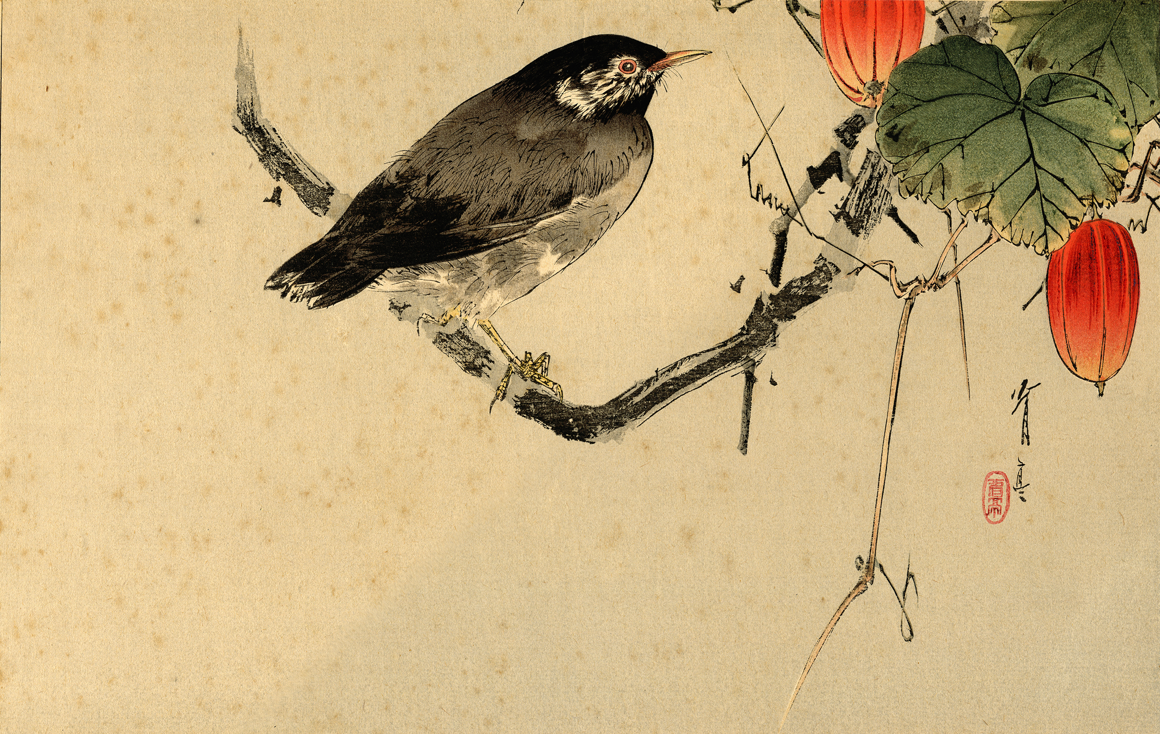
That said, I have later learned that the essence of simplicity in art does indeed require enormous skill and sophistication of mind and hand. I find that some of the hand scrolls, paintings and screens of the Momoyama and Edo periods in Japanese art (1573-1615 and 1615-1868 respectively) are the essence of aesthetic simplicity and oh so utterly beautiful. Many years ago, there was a truly wonderful exhibition and Harry Abrams catalogue publication, "Birds, Beasts, Blossoms and Bugs. The Nature of Japan". I frequently dip back into this publication because I find it of enormous inspiration and nurture, reminding me, particularly for silverpoint drawing, that as long as I really, really know the subject matter I am drawing, less is really, definitely more.

An example of such basic mastery is, for instance (and very a-propos with our autumnal migrating flocks of crows streaming noisily past our windows), a series of three ink paintings with wash on paper of crows, "Snow, Moon and Flower". One, " Crow in flight before the Moon", by Maruyama Okyo (1733-1795), is just a deftly detailed crow silhouetted in flight with the moon half delineated in white behind him - so minimalist it is breath-taking. And one has to remember this is a brush painting in ink - no room for hesitations, erasures, or even running out of ink at the wrong moment. Certainly one definition of "immediacy". Another of these paintings is "Crow on a Plum Branch" by Matsumura Goshun (1752-1811): the bird perches on the branch in simple, believable reality, yet he is pared down to only the essential detail. The plum branch is reduced to a shorthand suggestion which, nonetheless, is entirely complete in its depiction.

Crow on snow-covered Plum Branch, Kawanabe Kyosai, 1870----1880s, Colour woodblock print, (Image courtesy of the RISD Museum)

Crow on snow-covered Plum Branch, Kawanabe Kyosai, 1870----1880s, Colour woodblock print, (Image courtesy of the RISD Museum)

Another wonderful six-fold lacquer screen in the same show was of crows in flocks and gatherings of raucous intensity, just their silhouettes against the gold leaf on paper. It was executed by an unknown artist in the Edo period of the early 17th century, but done by someone who had studied this emblematic bird intensely, in all its attitudes and stances - at a time when there was no photography to freeze flight or movement. It is yet another wonderful example of back to basics – knowing your subject matter thoroughly, having a mastery of your technique and compositional intentions, and just following the age-old tradition of an artist using hand and eye to create images that convey messages of beauty, angst, joy, whatever.